Design System Implementation
Sept 2023 - Present
Design System Creation, Style Guide Development, Component Library Building
This project aimed to establish a centralized design system. The goal was to streamline design workflows, enhance consistency across projects, and improve communication between design and development teams.
Prior to implementing the design system, our design process faced several challenges:
Inconsistency: Inconsistent UI elements across projects led to a confusing user experience.
Slow Hand-offs: Extensive time was spent explaining design decisions to developers during hand-offs.
Limited Reusability: Repetitive creation of UI components resulted in wasted effort and technical debt.
To address these challenges, we developed a comprehensive design system using Figma:
We utilized Figma to create a single source of truth for all design elements, including:
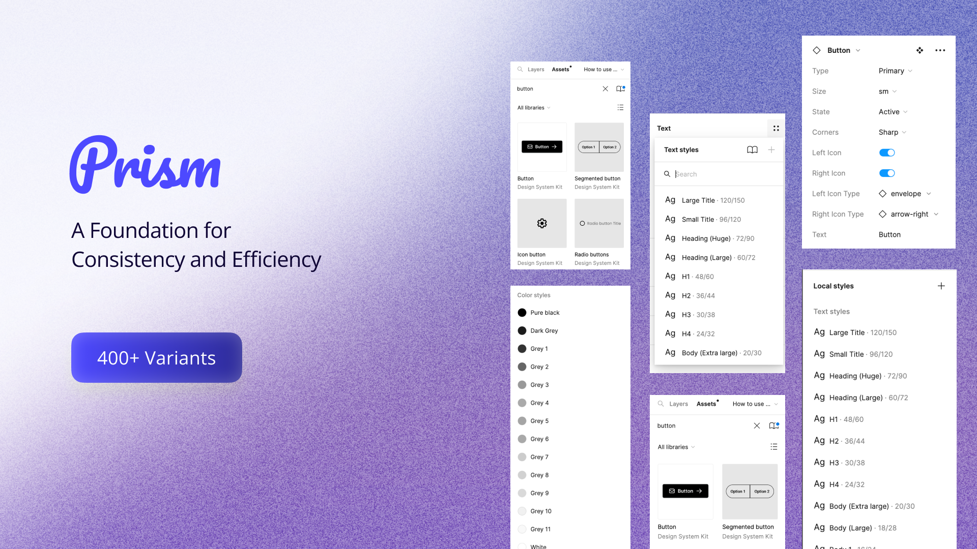
Style Guide: A detailed guide outlining design principles, colors, typography, spacing, and accessibility considerations.
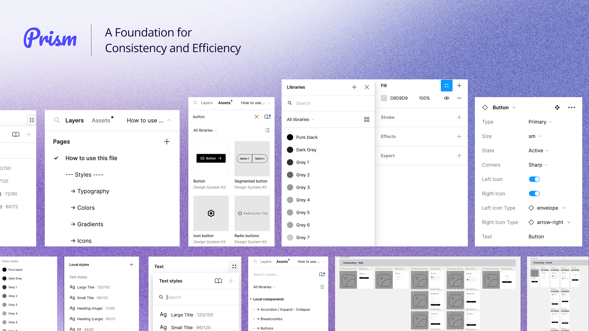
Component Library: A collection of reusable UI components built in Figma, each with clear documentation and usage guidelines.
Mock Screens: Pre-designed screens representing common UI layouts and functionalities, ideal for rapid wireframing and prototyping.

Understanding Needs: We conducted design audits and workshops to identify pain points and understand design requirements for developers and designers.
Design Language: Established a consistent design language that defines the visual identity and UI elements of our products.
Component Inventory: Catalogued existing UI components across projects to identify opportunities for standardization and consolidation.
User Research: Gathered user feedback to understand user expectations and preferences for UI consistency.
Our ideation process for a centralized design system focuses on achieving consistency, efficiency, scalability, and collaboration. We envision a repository housing reusable components, comprehensive documentation, and version control. Anticipating challenges such as adoption, maintenance, and customization, we'll conduct thorough research through interviews, surveys, and usability testing. Our roadmap includes defining core components, developing a comprehensive style guide, building a component library, and conducting pilot testing. To ensure seamless integration and accessibility, we'll explore compatibility with development tools and conduct regular audits.

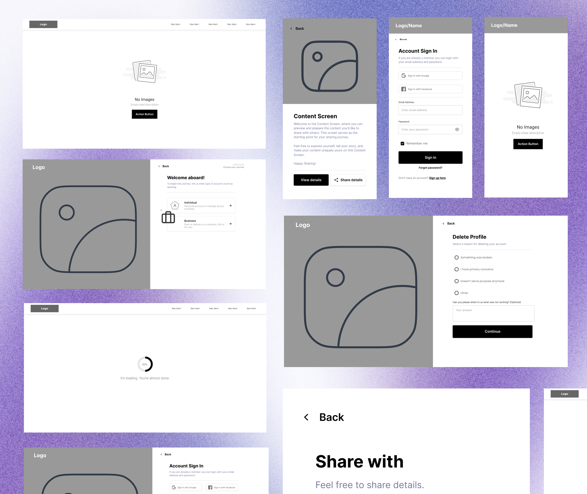
Our design system is a comprehensive toolkit that empowers our team to create consistent, efficient, and user-friendly products. At its core, the system is built upon three pillars: a detailed style guide, a robust component library, and a collection of pre-designed mock screens.
Style Guide: Our comprehensive style guide serves as the foundation for our design system, providing a unified framework for all team members. It outlines core design principles, such as simplicity, clarity, and accessibility, to guide decision-making. We've meticulously defined color palettes that align with our brand identity and ensure visual consistency across our products. Additionally, our typography guidelines specify font choices, sizes, weights, and spacing to create a harmonious and legible reading experience. To ensure inclusivity, we've incorporated accessibility guidelines to make our products usable by people with disabilities.
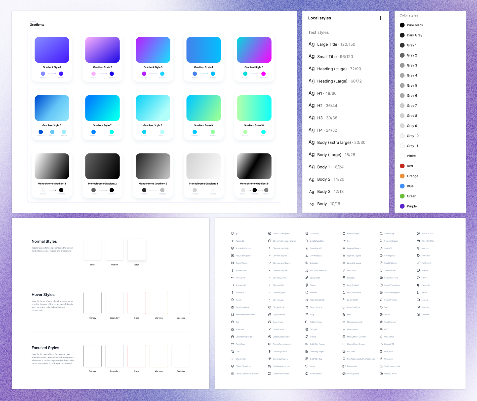
Component Library: Our component library is a treasure trove of reusable UI elements, such as buttons, inputs, labels, cards, navigation elements, and more. Each component is accompanied by clear documentation outlining its purpose, usage guidelines, and any specific requirements or limitations. For developers, we've provided code snippets or examples to accelerate implementation and reduce errors. By leveraging this library, we've significantly reduced development time and ensured consistency across our products.
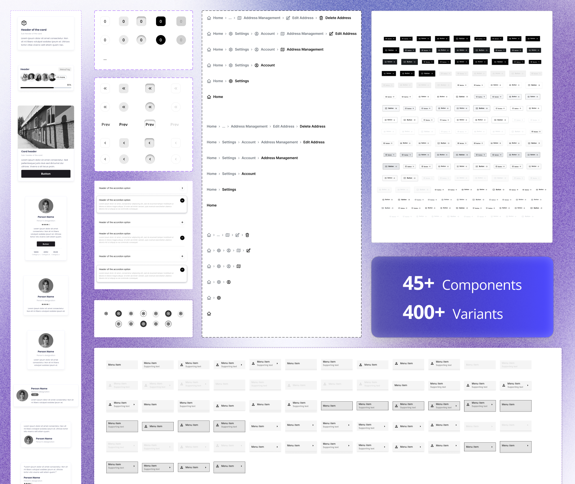
Mock Screens: Our mock screens are pre-designed templates that represent common UI layouts and functionalities. They serve as a visual reference for both designers and developers, facilitating rapid prototyping and iteration. By using mock screens, we can quickly visualize different design concepts and gather feedback from stakeholders before investing heavily in development. This iterative approach allows us to make informed decisions and refine our designs based on user input.
The Figma design system has yielded several positive outcomes:
Improved Consistency: Ensures a consistent and unified user experience across all products.
Faster Hand-offs: Streamlined hand-offs by providing designers with a single source of truth for design elements and developers with readily available component specifications.
Increased Efficiency: Reduces development time through reusable components and eliminates redundant design efforts.
Enhanced Collaboration: Promotes better collaboration between design and development teams through shared design assets and clear communication.
Building a design system has been a transformative experience for our company. It has significantly streamlined our design workflows, fostering improved communication and collaboration between design and development teams. By establishing a centralized repository of reusable components and guidelines, we've significantly enhanced our ability to deliver consistent and efficient products.
The system has had a profound impact on our development efficiency. Designers can now focus on creating innovative concepts without being bogged down by repetitive tasks, while developers have access to a library of pre-built components that accelerate their workflow. This has resulted in faster time-to-market and reduced development costs.
As our company continues to grow, our design system will evolve to meet our evolving needs. We anticipate expanding the component library, refining our style guide, and exploring new technologies to further optimize our design and development processes. The foundation we've laid with our design system will serve as a catalyst for continued innovation and success.